Islamorada Luxe Charters
Premium charter experience in the sportfishing capital. Luxury meets offshore adventure.
The Challenge
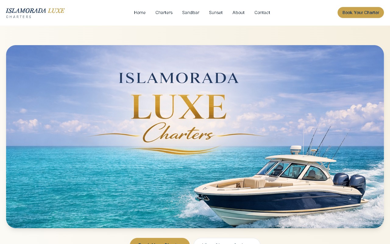
Islamorada Luxe Charters positions itself as the premium charter experience in the Keys — the kind of operation high-end guests book when they want private-boat offshore fishing without the tackle-shop aesthetic that dominates most charter sites. The website needed to reflect that positioning: elevated design, smooth UX, and a visual feel that says “this isn’t your average fishing trip” before anyone reads a single word of copy.
The existing site looked like every other charter in the Keys — bright yellows, tournament photos, price-first pitch. Great for volume charters, wrong for the luxury segment. The new brief called for serif typography, editorial photography, a quieter color palette, and a booking experience that feels closer to a boutique hotel reservation than a party-boat ticket counter.
The Build
Astro with Tailwind, designed with a more refined aesthetic. Clean typography, generous whitespace, and imagery that communicates luxury without losing the saltwater edge. Built to load fast and look premium on every device.
What went into the design:
- Editorial-grade typography — display serif for hero headlines, clean sans-serif for body, monospaced accents for trip details. Hierarchy that reads like a magazine spread, not a pricing sheet.
- Neutral palette with a single accent — deep navy, warm off-white, brushed gold for CTAs. No neon. No aggressive gradients.
- Cinematic hero imagery — full-bleed drone and water-level photography, carefully compressed to ship under 300KB per hero on mobile without visible quality loss.
- Whisper-quiet animations — subtle fade-in reveals on scroll, no bouncing buttons, no auto-playing video. The site feels expensive because it doesn’t try to prove it’s expensive.
- Booking flow that matches the brand — reservation form uses the same serif typography, confirmation copy reads like a concierge email rather than a transactional receipt.
The Result
A site that elevates the charter brand above the noise. Premium feel, fast performance, and a booking flow that matches the quality of the experience on the water. Trip inquiries now skew toward higher-value full-day and overnight bookings, and the operator has been able to raise rates without losing conversion — the site makes the price make sense.